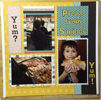
Do you have a “style” to your scrapbooking? While there are probably as many different styles as there are scrapbookers it seems like there are 3 basic types of layouts. First, there is the simple layout. This focuses mostly on the photos and often the stories behind the photos, using maybe only a bit of cardstock on their pages and just a few, if any, embellishments. Then we have the “grand” layouts. These pages often incorporate different techniques and many products and tools are used to create them. That leaves us with those layouts that fall somewhere in between the simple & grand styles. These pages dip their toes in the fun stuff but resist going in head first. Pages that have just enough fun stuff to compliment the photos. It’s these types of pages that I seen to complete most often.
Before going any further I want to say that one style is better than another and there is room for ALL types of scrapbookers!
There are no scrapbooking police.
(Thank goodness!)
These are your pages and you have permission to do what makes YOU happy (not that you need it but there it is just in case)! And just because you are usually are a more simple scrapper does not mean you can’t do a grand page whenever you want & vice versa! Before going any further I want to say that one style is better than another and there is room for ALL types of scrapbookers!
There are no scrapbooking police.
(Thank goodness!)

Whatever your scrappy style is, I think you will find the Fast2Fabulous (F2F) pages from Creative Memories a nice option. These pages are pre-decorated (some more than others) – many have matching coversets and they are so versatile! You can easily use them as is - simply adding your photos for a very quick page or you can get creative and use them as a starting point. Most of the pages have coordinating papers and Slide-in packs and a few of the F2F packs (Be Bold and Flourish (BB&F) and Look on the Bright Side) have pages with just a bit of decoration & plenty of open space.
Below are 2 simple layouts using F2F pages from the Be Bold and Flourish pack.

All I added to the BB&F F2F page above is the element to the right. I cut a bit of turquoise paper from the top so it would stand out more. It is from the Be Bright and Flourish Slide-in Pack. The yellow boxes are printed right on the page – perfectly sized for 4x6 photos.

I again added pieces to this F2F page from the Be Bright and Flourish Slide-in Pack (the striped papers) and also I matted one of the photos with paper from the Be Bold and Flourish paper pack. I wanted that to stand out a bit from the others because I <3 it!
With the addition of journaling I’d be happy to put these in our family album.
Sometimes I want to be just a little more creative so I add a little bit more decoration to those layouts – like the ones below.

The new Black ABC/123 Stickers were perfect for adding a title to the page – not necessary, I included that info in my journaling, but I like it!

I added a little more paper from the Be Bold and Flourish paper pack, some more ABC/123 Stickers (Gold and Black) and added a little bit of detail using the Black Dual Tip Pen. That helped the Gold ABC/123 stickers & lighter paper stand out a bit.
Take a closer look at the new & improved ABC/123 stickers from CM in this video:
I’m satisfied with this layout but if I wanted to make it a little more “grand” I could add some detail, maybe a border using the Border Maker System, to the bottom of that journal block – or over the white line behind the photo of the sunflowers. Other ways to make these pages a bit more grand: double mat the photos (or just the favorites) use the Two-Way Corner Rounder on the photos, add some more decorative elements from the BB&F Slide-in Pack or Paper Pack…the sky’s the limit!

Click here to see the papers in the BB&F Paper pack.

Click here to see the papers in the BB&F Slide-in pack.
Click here to see the pages in the BB&F F2F pack.
What is your scrappy style?


No comments:
Post a Comment